
GTI: Premium - User Guide
Welcome to the Global Trends Investor (GTI) user guide for GTI: Premium. The aim of GTI: Premium is to equip you with the data you need to embrace trend-following within your investment strategy. From simplified trend-scoring systems to trend strength metrics and summary insights, GTI: Premium covers over 2,000 global stocks, putting power in your hands to speed up and advance your research process. Used wisely, this dataset can improve returns, lower risk, and enhance your investing discipline.
The primary purpose of this user guide is to help you navigate the core GTI: Premium service, which is the spreadsheet. For a broader introduction to the methodology and terminology used for Global Trends, please read our GTI User Guide.
The Key Concept: Ranking Global Stocks using CAPR
The key concept used in the Global Trends Investor is CAPR – Currency-Adjusted Price Relative. This is a system of charting where a stock or asset is plotted relative to the world index. There are four important points to note about CAPR:
- CAPR converts all stocks and asset performance into a common currency, USD.
- Adjusting for currency is crucial to accurately assess performance, as without it, exchange rate fluctuations can distort returns.
- Additionally, it enables meaningful comparisons across global markets.
- CAPR is measured relative to the World Index, which is also priced in USD.
- That means CAPR is a ratio and has no units. When that ratio is in an uptrend, it means the stock or asset is outperforming the broader market. The same is true in reverse; when the ratio is in a downtrend, it is underperforming the broader market.
- Consequently, CAPR can be used by investors worldwide, as the comparison is consistent, no matter which currency the stock trades in.
- CAPR is used to identify whether a stock is outperforming or underperforming the broader market.
- When the CAPR line is rising, it indicates that the stock or asset is outperforming the world index on a currency-adjusted basis. Conversely, when the line is falling, it suggests underperformance.
- Price charts are converted into CAPR to show currency-adjusted relative performance, giving much more useful information and signals compared to multi-currency simple price charts.
4. Unique to ByteTree, CAPR is presented using the ByteTrend scoring system (ranging from 0 to 5) to quantify the strength of a trend. The score is calculated as the sum of the following criteria, where each instance that is TRUE scores 1 point, and FALSE 0 points:
- Is the CAPR above the long-term moving average (200-week)?
- Is the CAPR above the short-term moving average (30-week)?
- Is the 200-week (long-term) moving average of the CAPR rising?
- Is the 30-week (short-term) moving average of the CAPR rising?
- Did CAPR last touch the maximum on the 20-week max/min lines?
If an asset or stock is trending strongly, i.e. outperforming the World Index, each of the above criteria will be met, in which case the total score will be 5. Conversely, if an asset or stock is significantly underperforming the World Index, none of the above criteria will be met; in this case, the total score would be 0. This scoring system provides a simple numerical expression of relative trend strength (i.e., relative to the world) and is key for identifying the strong and weak trends outlined in the spreadsheet.
Navigating the Spreadsheet
At the core of GTI: Premium is the substantial dataset of over 2,000 stocks, delivered as a spreadsheet. The spreadsheet is organised into seven primary tabs. The first four tabs are the key trend categories:
- Leading
- Emerging
- Weakening
- Bearish
These tabs will respectively only contain the stocks that meet the criteria for that trend category each week. They have been structured in the following format:
- Ticker
- FX – Currency
- Name – Company name (shortened)
- CAPR – Currency Adjusted Price Relative score
- Dev High– % deviation from the 30-week CAPR High (“0” means the CAPR is at a 30-week high, whereas “-ve” means it is below it)
- Dev Low – % deviation from the 30-week CAPR Low (“0” means the CAPR is at a 30-week low, whereas “+ve” means it is above it)
- Vol – 360-day volatility
- Cap is the market capitalisation, in USD billions
- Sector - Abbreviated
- Industry - Abbreviated
For uniformity, this layout is consistent with GTI: 200 (our free GTI newsletter).
Aside from the four trend categories, there are three other tabs: “All Stocks”, “User Guide” and “Insights”. Marked in black is the All Stocks tab, which contains every stock in the universe, again, in the same format as the trend category tabs. This is where you can view all stocks, regardless of their trend category. Then, there is the User Guide tab, which contains the glossary and links to this page. Finally, there is the Insights tab, where we share aggregated insights that help shed light on what’s trending across different geographies, sectors, risk profiles and more. This will be covered in more detail in the “Insights” section further below in this User Guide.
While the above covers the tabs that are visible at first glance, GTI: Premium offers more than what initially meets the eye. Go to any of the four key trend categories or the All Stocks tab and click the plus sign [+]just above and to the right of the farthest column. This will open up more columns of key data on each stock, including:
- Geography
- Additional Trend Strength Measures
- Volatility Category
- Trend Extension Measures (% deviation from moving averages) in local currency and CAPR terms
Geography assigns both the region (Europe, North America, Latin America, Asia Pacific, or Emerging Market) and the country for each stock. This can reveal interesting insights about the composition of the world stockmarket, e.g. where trends are the strongest at any given moment.
Additional Trend Strength Measures provide further context by displaying ByteTrend scores in local currency terms, which may differ from CAPR due to currency fluctuations. Although this is precisely what CAPR removes to avoid distorted returns reporting, it can be useful information in some contexts. The cumulative 12-week highs reflect how consistently it has hit new highs each week over the last three months, with a maximum of twelve times.
Volatility (standard deviation of the price over the past year) is included because it is an important and often underestimated signal. Low volatility reflects company stability and investor confidence. This is difficult to achieve, so stocks in the low volatility category reflect higher-quality companies. That said, volatile stocks have the potential to move faster.
Trend Extension Measures show the percentage deviations from the 30- and 200-week moving averages in both local currency and CAPR. This is a great tool for quickly identifying which stocks are far ahead of, in line with, or behind their trends.
Suggestions for Use
There are infinite ways to use the data provided in GTI: Premium. You might use it to check the trend strength of each of your own portfolio’s holdings or for identifying new stocks you could add. Some investors prefer to buy the most oversold stocks (trend extension), while others prefer the current price to be above the 200-day moving average.. There are many ways to invest, and GTI: Premium is a powerful technical tool for enhancing your existing investment process. While not all strategies will be suitable for everyone, this section aims to share a few suggestions to get you started.
Identifying Notable Stock Deviations
In the strong trends (leading and emerging), you can rank them by their 30-week lows, using the filter in column G, “% Dev from CAPR 30W Low”. This would show which stocks are the furthest ahead of their trend over the last 30 weeks.
For weak trends (weakening and bearish), use the filter in column F to rank the trend category by its deviation from the 30-week highs. This will highlight the most oversold stocks in the weak categories.
Ranking by Sector and Region
You can use column L (“Sector”) to filter for a single sector or a group. This will allow you to see which stocks in that sector are the strongest globally, e.g., Consumer Discretionary. You could also use it to filter out certain sectors, like oil and gas or financials.
For an even more granular view, you could apply the same method to column M (“Industry”). This would, for example, allow you to highlight the alcohol or soft drink companies within Consumer Discretionary. The same method could also be applied to “Region” (column O) or “Country” (column P).
Screening by Volatility
Using column I (“Vol”), you can screen out high-volatility companies, creating a strong proxy for high-quality, stable businesses. Using the filter, you can choose to view only companies with volatility below a certain level, or, if you prefer, above a certain level. You can also use column U (“Vol Category”) to filter stocks by high, medium, or low volatility.
Identifying Very Long-Term Trends
For identifying even longer-term trends, column AB (“200W High”) allows you to filter for companies that are trading at their 200-week high in CAPR. These stocks have never been higher, relative to the World Index in the same currency, in four years, and are very strong trends.
Insights
The Insights tab consolidates a vast amount of time-series data. This is presented in a visual format that aims to deliver insights into momentum, breadth, geography, and sector strength, as well as how these factors evolve over time. In essence, it helps identify bigger shifts and market structures.
In the following section, we will break down the core information for each chart in the Insights tab, moving left to right, row by row. These charts are extracted from the GTI: Premium issue published on 16th May 2025.
Global Trend Overview - Geography & Sectors
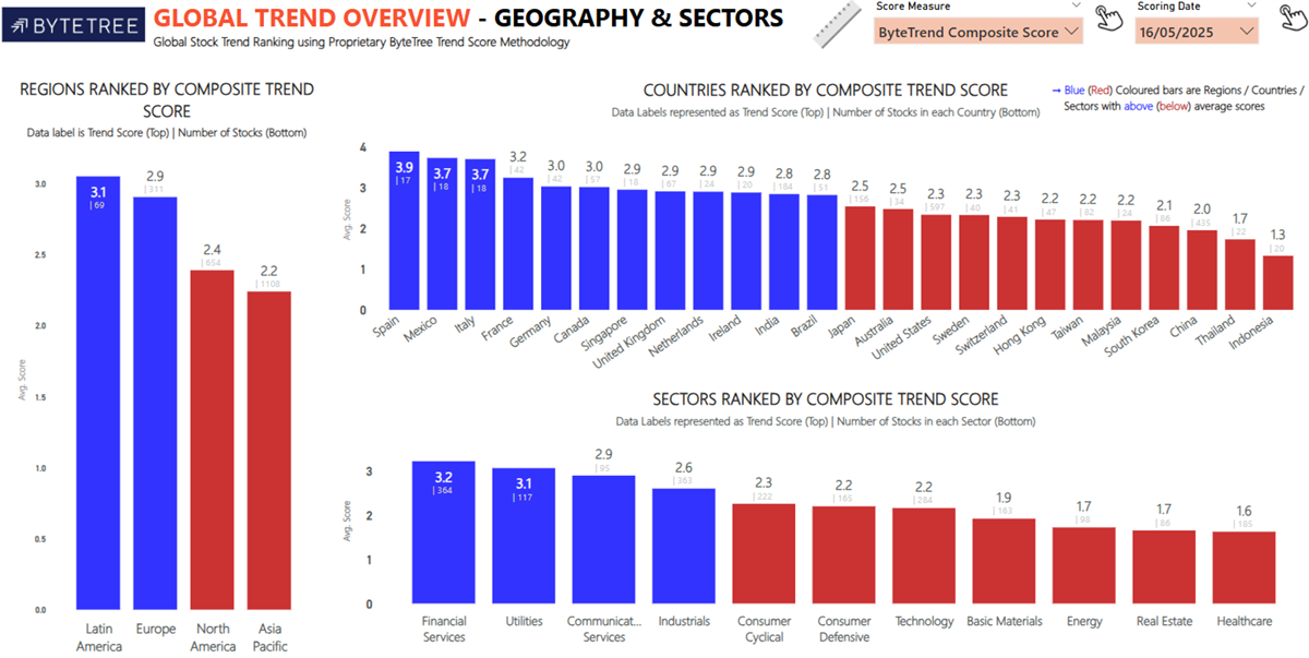
The Global Trend Overview – Geography & Sectors displays the average score for all stocks in a given country or sector. The strongest half is shown in blue, and the weakest half in red. Regions are on the left, countries on the top, and sectors are on the bottom.
Global Trend Overview – Weekly Trends
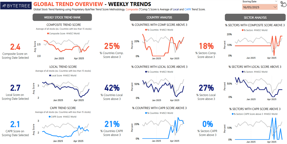
The second Global Trend Overview – Weekly Trends image is a continuation of the previous insight and shows the average CAPR Score across all countries over time. It also highlights the percentage of countries with a CAPR score, local score and a composite score (the average of CAPR and local). A score of 3 represents average (neutral), so a score above 3 means outperforming the average.
Country Trend Score Analysis
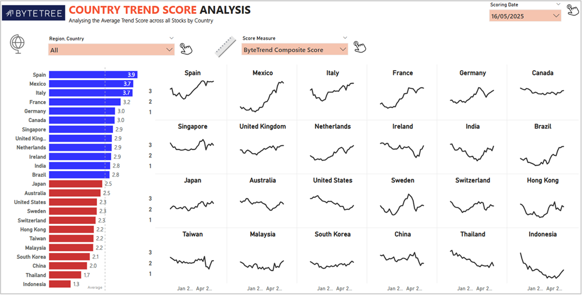
The Country Trend Score Analysis displays the average score for each country composite (as of the latest date) on the left, and the respective country’s trend over the last 30 weeks is on the right. This will highlight if any of the 24 countries is strengthening (line is rising) or fading away in a single image.
Country Breadth Analysis
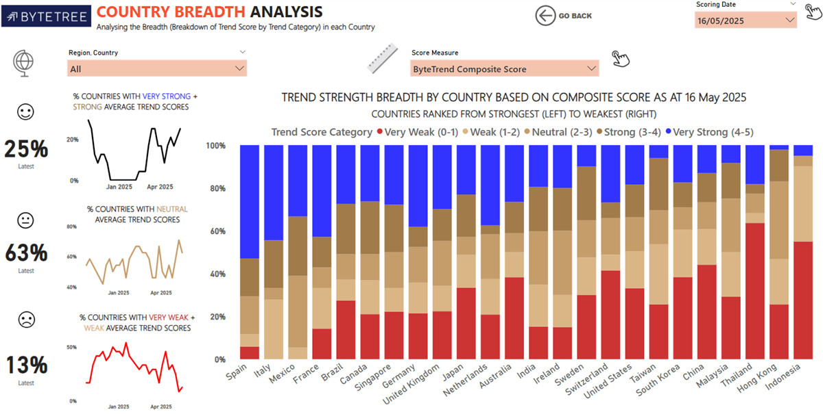
The Country Breadth Analysis shows the number of countries with strong, neutral, or weak trends. The breadth chart on the right highlights the current number of each trend category for the individual country. However, please note that the scores in this section represent the composite score, i.e. the average of the CAPR score and the local score.
Country Breadth Analysis – Weekly Trend
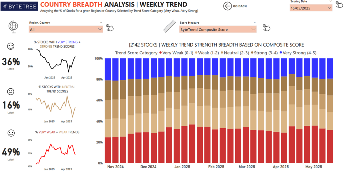
The Country Breadth Analysis Weekly Trend shows the global weekly number of each trend category over the last 30 weeks.
Country Trend Type Analysis
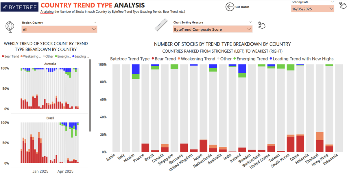
The Country Trend Type Analysis shows the number of stocks in each trend category by country.
Sector Breadth Analysis
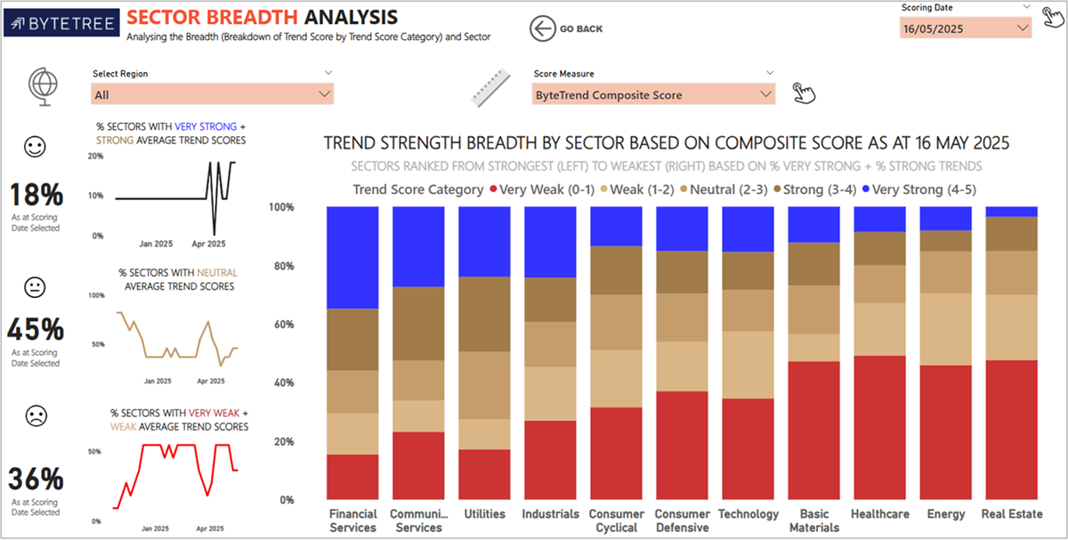
The Sector Breadth Analysis shows the percentage of sectors with strong, neutral, and weak trends over time down the left-hand side, as well as the breakdown for each sector (main bar chart).
Sector Breadth Analysis – Weekly Trend
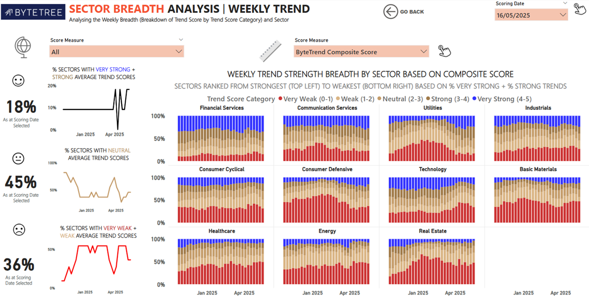
The Sector Breadth Analysis Weekly Trend shows the same data as “Sector Breadth Analysis”, but over the last 30 weeks, so you can see how the breakdown of trends in each sector has changed over that time.
Sector Trend Type Analysis
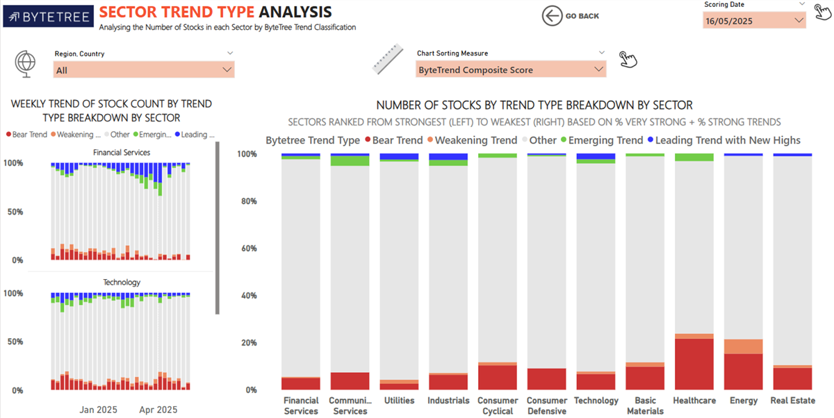
The Sector Trend Type Analysis shows the number of stocks in each of the four trend categories within each sector. Comparing this to the Sector Breadth Analysis chart is a good way to visualise how the Global Trends methodology shrinks the pool of trends to only the most powerful.
Region + Sector Analysis
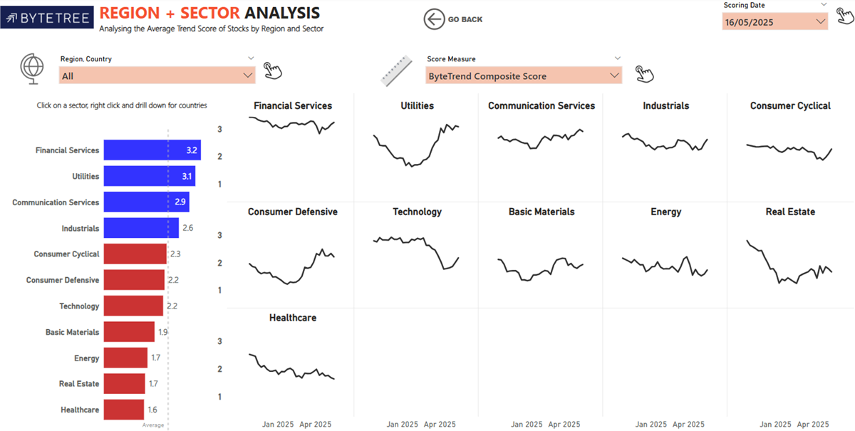
The Region + Sector Analysis shows the average composite score in each sector and its performance over the past 30 weeks.
Region + Sector Heatmap
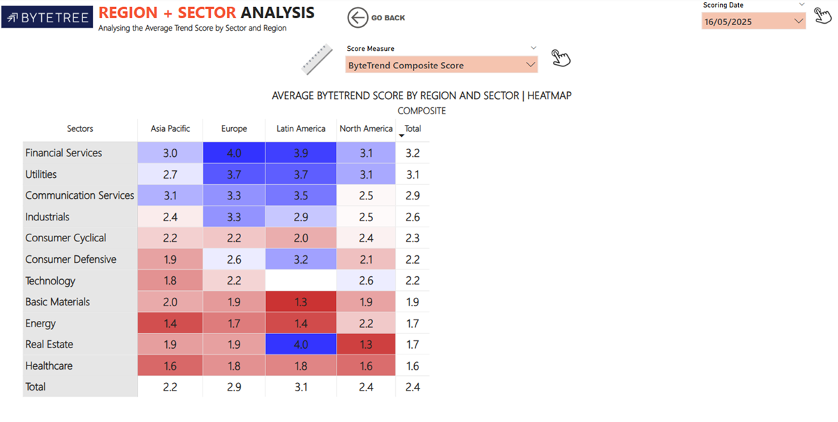
The second Region + Sector Analysis section consists of a table showing the average composite score by sector, broken down by region, and plotted as a heatmap. This highlights both sector strengths and geographical differences.
Region + Volatility Analysis
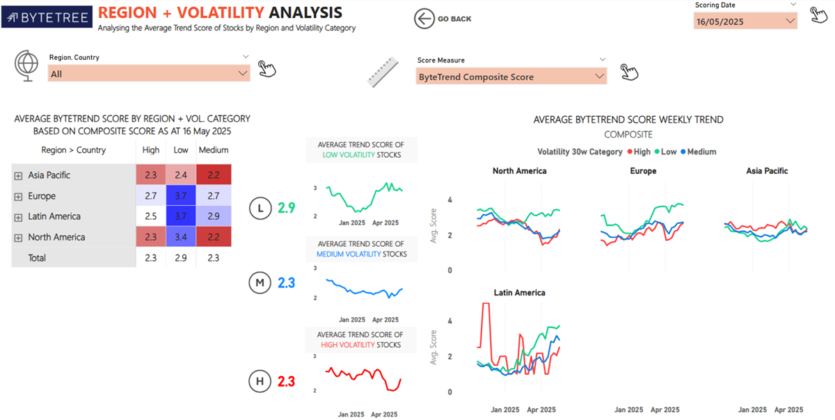
The Region + Volatility Analysis shows the average ByteTrend composite scores of high, medium and low volatility stocks for each region. Understanding the volatility is important because it highlights how each volatility category is trending by region and how that trend has changed over time.
Sector + Volatility Analysis
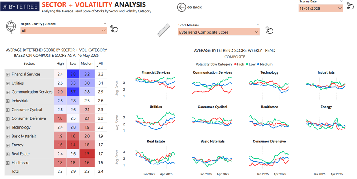
The Sector + Volatility Analysis shows the average ByteTrend composite scores for high, medium, and low volatility stocks in each sector. In risk-off environments, low volatility stocks and sectors often trend stronger as investors seek more stable opportunities.
Global Trend Classification
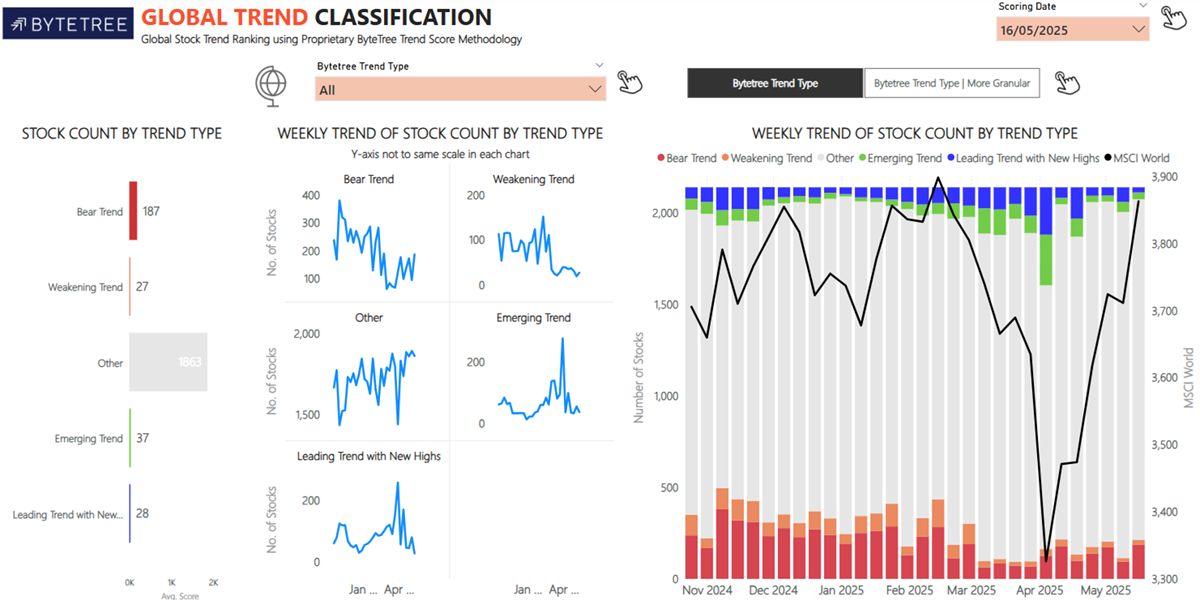
The Global Trend Classification shows the number of stocks in each trend category (leading, emerging, weakening, bearish) across the entire GTI: Premium universe. The chart on the right tracks the total of each trend category overlaid with the World Index over time.
That concludes the run-through of the Insights page. To finish the GTI: Premium User Guide, there is a glossary of terms below.
Glossary
| Score CAP | A score from 0 to 5 indicates how many criteria are met in the five-point ByteTrend Scoring System, which uses CAPR (price of a stock relative to the market and adjusted for currency) to assess trend strength. A higher score means the asset is outperforming the market (rising CAPR), while a lower score suggests underperformance. |
| % Dev from CAPR 30W High | Measures the deviation of a stock’s current CAPR-adjusted price from its highest CAPR level over the past 30 weeks. A value near 0% indicates a strong uptrend, with the stock trading close to its peak. The more negative the value, the further it is from the high, suggesting a weaker trend. |
| % Dev from CAPR 30W Low | Measures the deviation of the stock’s current CAPR-adjusted price from its lowest CAPR level over the past 30 weeks. A value near 0% indicates the stock is trading close to its relative low — a sign of weakness. The more positive the value, the further it is from the low, suggesting a stronger recovery or uptrend. |
| Annualised Volatility 30w | The 30-week volatility (standard deviation) of the share price, converted to an annual figure. A higher number indicates that the price tends to fluctuate more, indicating greater risk. |
| Market Cap Millions USD | The total value of a company in dollars is calculated by multiplying the share price by the number of shares. It demonstrates the company’s size. |
| Score Local FX | Scored from 0 to 5, indicating how many criteria are met in the five-point ByteTrend Scoring System for the stock’s price movement in local currency (i.e. not relative to the market as is the case in CAPR). A higher score means the stock is in a stronger uptrend, while a lower score suggests a weaker trend. |
| Cumulative Highs in 12W | Shows how many times a stock has made a new high in the last 12 weeks. |
| Annualised Volatility 30w Category | Shows how a stock's annualised 30-week volatility compares to others, helping to identify its price risk category: Low, Medium, or High. Stocks are ranked by their volatility and grouped into percentiles: Top 20% = High Volatility (High Price Risk); Bottom 20% = Low Volatility (Low Price Risk); Middle 60% = Medium Volatility (Medium Price Risk). |
| % Dev from 30W High Local Price | Shows the deviation of the current share price below its highest price in the past 30 weeks, in local currency. Values are 0% or negative, where 0% means that the stock is at its 30-week high, indicating a strong uptrend. The more negative the value, the further it is from the high; a sign of weakness. |
| % Dev from 30W Low Local Price | Shows the deviation of the current share price above its lowest price in the past 30 weeks, in local currency. Values are 0% or positive, where 0% means the stock is at its 30-week low, indicating weakness. The higher the value, the further it is from the low, indicating recovery or strength. |
| % Dev from 200W High Local Price | Shows the deviation of the current share price below its highest price in the past 200 weeks, in local currency. Values are 0% or negative, where 0% means that the stock is at its 30-week high, indicating a strong uptrend. The more negative the value, the further it is from the high; a sign of weakness. |
| % Dev from 200W Moving Average (MA) | Shows the deviation of the current share price from its 200-week moving average, in local currency. Values can be positive or negative: A positive value means the stock is trading above its long-term average, which is a potential sign of strength. A negative value means it's trading below its long-term average, which may suggest weakness or a downtrend. |
| % Dev from 200W High CAPR | Measures the deviation of a stock’s current CAPR-adjusted price from its highest CAPR level over the past 200 weeks. A value near 0% indicates a strong uptrend, with the stock trading close to its peak. The more negative the value, the further it is from the high, suggesting a weaker trend. |
| % Dev from 200W CAPR MA | Shows how far the current CAPR is from its 200-week moving average. Values can be positive or negative: A positive value means the stock is trading above its long-term average, which is a potential sign of a relative outperformance trend. A negative value means it's trading below the average, which may indicate a relative underperformance trend. |